Evaluation
Task 1 and 2- Regarding my researching skills, I believe that the information that I can obtain is very high and the amount of information is enough to be seen as appropriate for the task that was set however I could have researched operating systems and data as well as the obvious.
Task 3 - In this particular Task I believe that the system of passing around a mind map through the class worked effectively as we came up with new and improved ideas. This said in our group we came up with a basic idea of a candy or sweet themed game. We researched the enemies which could be rotten fruit and sweets while the good guys could be fruit, veg and sweets.
Task 4 - By using the basic ideas in Task 3, we came up with a game design which was named "Kandy Kingdom". Using everybody's artistic talent we gathered an array of characters and titles. The basic idea was then presented to the class. The idea was cute yet effective for the younger generation however if I was to do this task again I would draw the pictures on Photoshop to give the presentation of our work a professional and realistic feel.
Task 5 - In this task we had to come up with a game character who is created by word association. I used Dangerous Dolphin as my character and have created a muscle man as my picture. If I was to recreate this Task I would have made the character simpler and easier to draw as it was difficult to finish on time.
Wednesday 4 December 2013
Task 5
Word Association

CatchPhrase Project
Additional Work

This is a picture I created using the techniques learnt on the course. The shading of the character shows that she's in a low light environment and the background looks effective in making her stand out. In the course I have learnt to use a graphics tablet and Photoshop to their full potential.
Task 3


Age Range:
4-10
10-15
15-20
20-35
35-50
50-65

We used large pieces of paper that circled our class room in order to get ideas from everyone that helped with idea generation as we had more than one mind on the project.
We have chosen to use 4-10 year old's and we chosen to go with a candy themed game due to the ages.
We researched into other candy themed games and came up with Candy land.

In order to make our game interesting with the younger generation we needed to use lots of bright colours and recognised sweets and chocolates that you normally find in a shop.


We then researched different types of sweets and chocolates in order to see what we could put into the game such as Gummy bears, candy corns and named brands like Galaxy, Skittles, Mars bars and Smarties.
We then looked into how we could make our game educational and what the villains could be rotten food and gone off. This could teach children that gone off food can be bad for us but if we were to use fruits and vegetables as the heroes and civilians then we could show that fruits and vegetables can live with sweets and chocolates.
Task 6
Advertising Our Game


For advertising our game we have come up with a range of ideas based around the candy theme.
One idea was a chocolate bar wrapper ripped slightly to reveal the Xbox 360 case. This will be very obvious to candy lovers and chocolate lovers alike, it will also be able to be advertised to children. This will be the wrapper of the galaxy bar.
 Another idea is to get Kinder eggs to advertise our product, by using small toys in the capsules we could put our Xbox game on the small leaflet that is with the small toy.

Our other idea is to have small figures climbing up the stairs with candy items like licorice, candy ropes and other candy to climb the stairs with the fake Xbox game at the top which will be stuck on to the side of the stairs.
 Our last idea is to have our game advertised on a zebra crossing and this is easy to see since you have to walk over it, each character is on the lines of the zebra crossing.
One idea was a chocolate bar wrapper ripped slightly to reveal the Xbox 360 case. This will be very obvious to candy lovers and chocolate lovers alike, it will also be able to be advertised to children. This will be the wrapper of the galaxy bar.


Our other idea is to have small figures climbing up the stairs with candy items like licorice, candy ropes and other candy to climb the stairs with the fake Xbox game at the top which will be stuck on to the side of the stairs.

Task 4

Xbox & PlayStation Game
Age: 7+
(Little Violence)
We have decided to design a game for over 7 year old's. We have gone with a Candy/cute theme where the object of the game is to get away from sticky hands which want to eat your candy friends and your character whom you may create out of varies types of candies and sweets. You have to reach the Gum-ball palace in time in order to warn the Queen and save the Kandy Kingdom.


 The concept of Queen Lollipop is based of the Bubblegum Princess from Adventure time since she has pastel colours and she has a sweet and innocent feel to her. I used very light colours for her dress and hair since her personality which reflects this and she matches the roll of the Queen of a candy world. The colours are very random which matches the candy like feel where the colours are random and there is lots of sweets within her concept to match her role.
Her role in the game is to be in the cutscenes and the front box since she needs to be rescued from her palace from the evil hand and rotten fruit and vegetables.
Plot:
The Game's main objective is to get to Gumball palace in order to warn the Queen that the humans are coming to eat the candy and snack kingdom. The villains in the game are gone off sweets and fruits which try to contaminate your little characters and tasty friends. Cutlery and rotten vegetables are also the enemies which try to stop your character from reaching their goal to go to the castle and defeat the evil hand.
Character Concepts:


The presets created by Charlotte
You can choose from 8 preset characters or design your own with different sweets and fruits. The characters themselves are children and are based off Disney's 'Wreck it Ralph'. When designing your character you can choose the gender, face profile, eyes, colour of hair and eyes, hair styles and what type of sweet or fruit they are. The presets have their own names after fruits and candies, we decided to use fruits and vegetables as well to help teach kids that they can be just like the candies.Her role in the game is to be in the cutscenes and the front box since she needs to be rescued from her palace from the evil hand and rotten fruit and vegetables.
Environment
The environment is based on Willy Wonka's chocolate factory in the respect that everything is edible and it's full of bright colours. The environment can be interactive to a point that objects can be picked up and used within the game.
Task 2
Two Artists from 3 of the following:
-Game Concept
-Comic Book
-Graffiti
-Pop Art (1960's)
Include:
-Colour
-Light/Dark
-Symbolise
-size
-Perspective
Game Concept Art
Bioshock Infinite
-Game Concept
-Comic Book
-Graffiti
-Pop Art (1960's)
Include:
-Colour
-Light/Dark
-Symbolise
-size
-Perspective
Game Concept Art
Bioshock Infinite


Claire Hummel is the concept artist for Bioshock Infinite and created Elizabeth and some of the of the other characters within the game. The artist used 1910-1920's fashion to create the characters which will fit into the steam punk world. She has taken in mind the hair styles and body shapes of this time, to which her characters show this by how they stand with in the game. Their clothes also show a form of dignity and grace however the outfits also show a business perspective using waist coats and ties for the women. She also based her designs off Disney Princesses which gives the game a hint of comfort and innocence even though the colours become dark when the game goes into the war of Columbia.
Saw: The game


Sa-dekaronhes Esquivel, James Croley and Steve Holt are concept artists for Saw's Xbox game. The games are based off one and two in the film series and most of the iconic traps are also involved in the game in which the player is to escape from. The artwork is shown to be dark and murderous, giving Saw it's brutality rating with it's blood and gore. The environments within the game are based on a abandoned asylum and using dark, almost no use of colour it gives the player a sense that they are within the game and they can relate to the movies. Most of the game is shrouded in darkness and the player has to use a torch or lighter in order to see and the environment reflects this as the darkness is used to give out scares and the uncomfortable feeling when trying to save Saw's victims and escape. The instruments of torture used are actually everyday items which are created into these death traps with symbolises that anyone is capable of recreating saw.
Comic Book
Astro Boy
Astro Boy

Osamu Tezuka is the artist of Astro boy which is a Japanese, children's comic. It is based in the future where Toby, the son of the head of the ministry of science, dies in a car crash and his father recreates him in the form of a robot boy. Dr. Tenma, the father of Toby, built Astro in Toby's memory and treated him as lovingly as if he was the real Toby, but soon realized that the little robot could not fill the void of his lost son. The colours for Astro boy are very light and are mostly blocked colours which give him a slight shine due to the fact that he is a robot. The concept is very light and symbolises a sense of innocence within the modern world, the light from space also brightens the whole page. The fact that he is in Space makes him seem bigger and more of a hero as he''s flying through the milky way.


Hidekaz Himaruya is the Artist of Hetalia which is a webcomic in which the countries are personified into real people, using the stereotypes of each country such as America liking fast food, Italy loving pasta and pizza and Britain being posh however has a punk like form. The colours are block in the anime adaptation however in the comics it has no colour except for what the artist is using as his pencil.
Pop Art


Andy Warhol is a pop artist of the 1960's who is most famous for his work on the soup can and the Marilyn Monroe work. It is highly known throughout the world as he uses bright colours over the dull parts of a black and white image
Task 1
Point and Shoot

Even More Bloons
-Even more bloons is a cute children's game in which you are a cartoon monkey destroying balloons or as the title suggest 'bloons'. The game is extremely colourful and the levels are difficult making it an interesting game to play and to challenge children and adults alike, however the idea itself is a simple plot of just destroying balloons with different weapons. It is a free game on the internet and it is popular with school children, the game itself shows a cute sky background and block colours, suggesting an innocent game with good intentions.
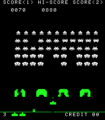 Space Invaders
-Space invaders is a fairly simple arcade game in the 1970's which has a very simple 8-bit design and simple plot, shoot the UFO's that will slowly come closer to you. The first game designs had hardly any colour and the characters are simple, however through our generations the game has developed into a fun and addictive arcade game which is now free on the internet. The game it's self has a black background to show the darkness of space and bright whites and colours to show the characters and ammunition, making it stand out.

Basketball
-This free internet game is a simple aim and shoot game which you use your mouse to point and click, throwing the ball into the basket with a time limit, it is very simple and innocent. The game itself has block colours which resemble that of the ball and the court, the blue background is simple and has a gradient which makes the game appealing. The game itself shows that it's intentions are simply to let the player experience basketball in a virtual level.
Environment in 1st person shooter
Bioshock Infinite
-The Bioshock series is famous for it's amazing graphics and beautiful environments however in the 2013 release, 'Bioshock Infinite' the game designers outdid themselves with taking the scene from the underwater city, Rapture and taking the game up in the clouds in the City of Columbia. The bright colours and the freedom give it an innocent feel and almost heavenly like until the game takes a turn and the environment changes from the beautiful heaven like city to the war struck rubble. The concepts of Columbia has beautiful colours and is light unlike it's predecessors, the buildings are mostly light colours to make it seem like the actually city is heaven however once the game takes a turn to war it changes to a darken environment where the flooring and the buildings are crumbling down, war ships appear in the distance and makes the environment unsettling... This appealing environment adds to the experience of the game.
Call of Duty MW3
-Call of Duty is probably the most famous first person shooter, with realistic and modern wars based on reality. It's environment is amazingly accurate and this just adds to the games charm, the colours used are very basic however it's suppose to come across as a war zone and the environment reflects this war time feel with realistic background sounds and the gunfire, explosions and crumbling architecture in the background. The game's environment is extremely detailed which gives it that sense of realism and perspective on war.
Half Life
 -Half Life as a sci-fi first person shooter has beautiful concepts and artwork for the game, the colours correspond with the realistic settings and the player can emerge themselves with in the game. The Sky and smoke look almost real and the water has a great reflection, common in newer games. However he hill or cliff edge in the backgrounds have sharp edges which ruins the realistic environment however all in all it still makes for an amazing game and experience.
Game Characters
Anna DeWitt (Elizabeth Comstock) - Bioshock Infinite
 -Anna DeWitt is the deuteragonist of Bioshock infinite and the main characters daughter. As a 19 year old woman she was designed after the Disney princesses with a slim waist and a tiny figure, her facial features are pretty and her modelling looks incredible. The creators of the character wanted her to be likeable and so they used Disney designs in order to create her character, personally I think what she adds to the game is a Heroine since she helps the main character in his quest, this is appealing to girls since she shows that she's far from weak and doesn't always need protecting or saving.
Sonic the Hedgehog - From varies games
 -Sonic is one of Sega's most famous characters, being able to run at incredible speeds around cute backdrops and saving his other furry friends, his character has bright colours which appeal to the younger generations and has the gloves which are styled after Disney and Looney Toon characters. The blue hedgehog is Sega's mascot to rival Nintendo's Mario and from then on out he has become one of the most famous characters in the world. His character is simple and loveable which makes him recognizable through the world.
Lee Everett
.jpg) -Lee is the main character from the walking dead game, his character is loveable throughout the game in which he looks after a young girl from the zombie apocalypse. The character design itself has bold lines to give it a comic book feel after the game itself was based off the comic book series. These bold lines give the character a comic look however the colours have a wide range, making the game seem more realistic. Lee throughout the game is controlled by the player, being able to change who lives and who is eaten by the zombies however the main plot still in tack. The shocking ending makes Lee's character a beautiful design and a generally great lead.
-Lee is the main character from the walking dead game, his character is loveable throughout the game in which he looks after a young girl from the zombie apocalypse. The character design itself has bold lines to give it a comic book feel after the game itself was based off the comic book series. These bold lines give the character a comic look however the colours have a wide range, making the game seem more realistic. Lee throughout the game is controlled by the player, being able to change who lives and who is eaten by the zombies however the main plot still in tack. The shocking ending makes Lee's character a beautiful design and a generally great lead.
Guerrilla marketing
Trolleys and Baskets
 This shopping basket is trying to promote donations to third-world countries, the child in the picture is holding his hand out for food, which the shopper or customer will place their groceries in. It is in your face and hard to turn from it, which makes you think more on the subject and convinces you to give money to charity. The picture looks real which makes it much more believable like the child is there, this is a great way of advertising as everyone will look down at their shopping trolley or basket.
Buses
 The Hang-men advertises human rights and against the death penalty, it's in your face since the small cardboard cutout people are hanging from bus grip hooks. The colours of the cutouts are very dark and gloomy, giving a sense of distress and important issues. The people have the information of the advertisement on the back of their shirts. This type of advertisement hangs on the grip hooks so then small children can not grab them since this issue is directed to adults and possibly older teenagers (16+)
Buildings and Billboards

Even More Bloons
-Even more bloons is a cute children's game in which you are a cartoon monkey destroying balloons or as the title suggest 'bloons'. The game is extremely colourful and the levels are difficult making it an interesting game to play and to challenge children and adults alike, however the idea itself is a simple plot of just destroying balloons with different weapons. It is a free game on the internet and it is popular with school children, the game itself shows a cute sky background and block colours, suggesting an innocent game with good intentions.

-Space invaders is a fairly simple arcade game in the 1970's which has a very simple 8-bit design and simple plot, shoot the UFO's that will slowly come closer to you. The first game designs had hardly any colour and the characters are simple, however through our generations the game has developed into a fun and addictive arcade game which is now free on the internet. The game it's self has a black background to show the darkness of space and bright whites and colours to show the characters and ammunition, making it stand out.

Basketball
-This free internet game is a simple aim and shoot game which you use your mouse to point and click, throwing the ball into the basket with a time limit, it is very simple and innocent. The game itself has block colours which resemble that of the ball and the court, the blue background is simple and has a gradient which makes the game appealing. The game itself shows that it's intentions are simply to let the player experience basketball in a virtual level.
Environment in 1st person shooter
Bioshock Infinite
-The Bioshock series is famous for it's amazing graphics and beautiful environments however in the 2013 release, 'Bioshock Infinite' the game designers outdid themselves with taking the scene from the underwater city, Rapture and taking the game up in the clouds in the City of Columbia. The bright colours and the freedom give it an innocent feel and almost heavenly like until the game takes a turn and the environment changes from the beautiful heaven like city to the war struck rubble. The concepts of Columbia has beautiful colours and is light unlike it's predecessors, the buildings are mostly light colours to make it seem like the actually city is heaven however once the game takes a turn to war it changes to a darken environment where the flooring and the buildings are crumbling down, war ships appear in the distance and makes the environment unsettling... This appealing environment adds to the experience of the game.
Call of Duty MW3
-Call of Duty is probably the most famous first person shooter, with realistic and modern wars based on reality. It's environment is amazingly accurate and this just adds to the games charm, the colours used are very basic however it's suppose to come across as a war zone and the environment reflects this war time feel with realistic background sounds and the gunfire, explosions and crumbling architecture in the background. The game's environment is extremely detailed which gives it that sense of realism and perspective on war.
Half Life
Game Characters
Anna DeWitt (Elizabeth Comstock) - Bioshock Infinite
Sonic the Hedgehog - From varies games
Lee Everett
Guerrilla marketing
Trolleys and Baskets
Buses
Buildings and Billboards
Billboards are specially designed for advertisement, however this billboard takes a new turn on the standard 2D boards. If the bright orange colour doesn't grab your attention then the fact that a part of the Billboard is on the ground will, this is again in your face and hard to ignore, it has meaning behind it that everyone hates 'dropped' calls, while the company states that their network has the fewest dropped calls. This is affective for business users and people who use their mobiles a lot for calling.
Subscribe to:
Posts (Atom)